 Get a Quote
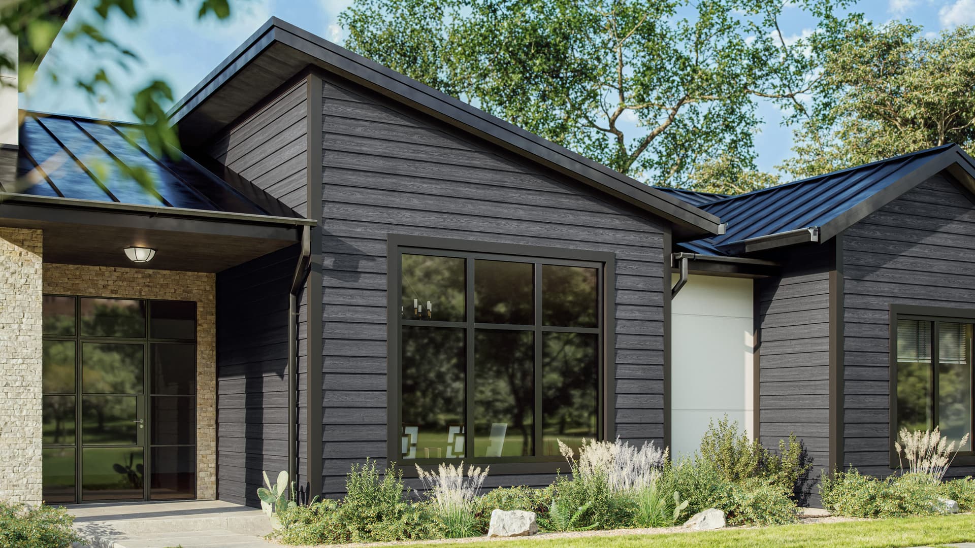
TimberHue™ Collection
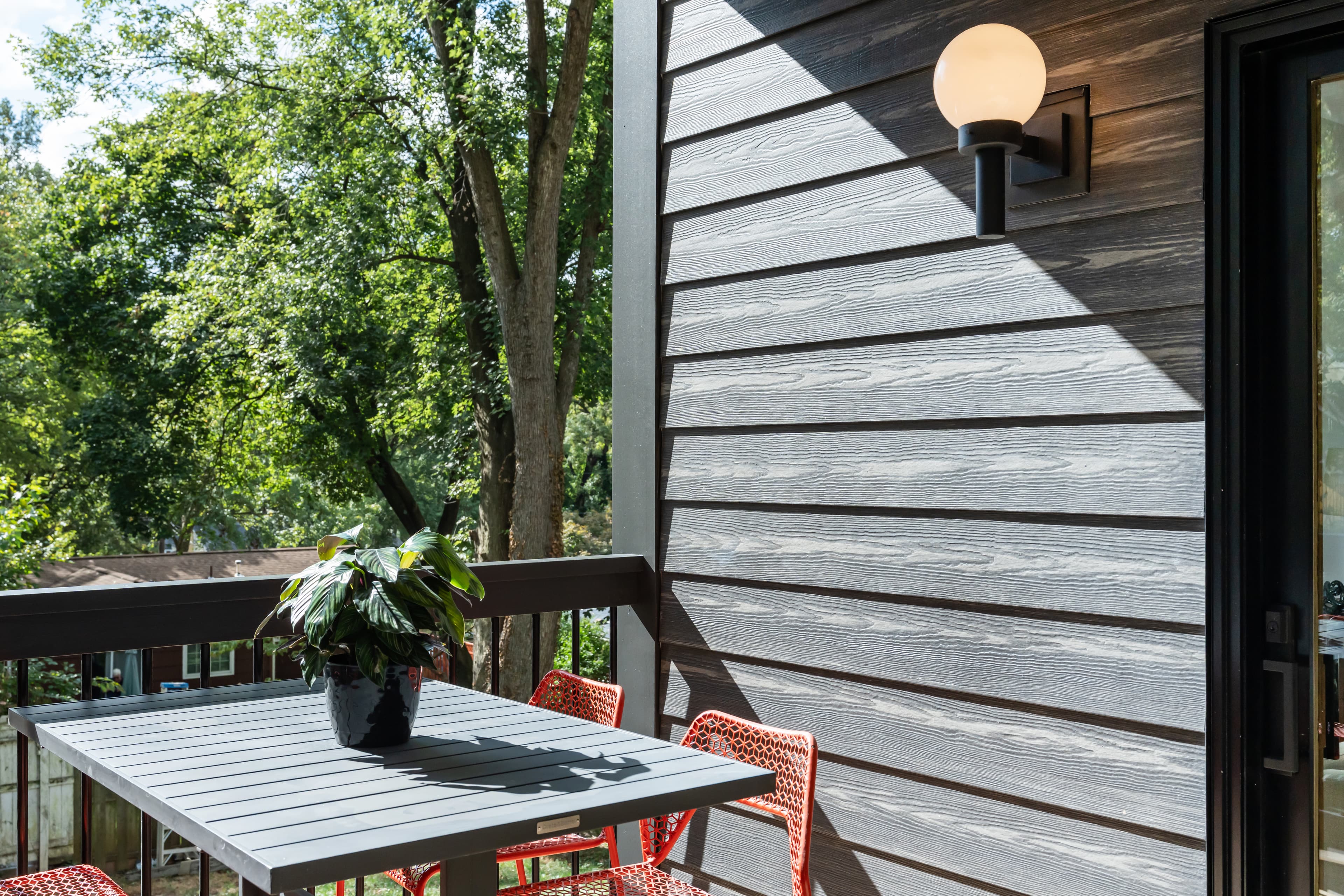
The TimberHue™ Collection by James Hardie honors wood’s legacy with a rich, authentic grain and two-tone finish that provides the warmth of a stained wood look, matched with the durability and low maintenance of Hardie® fiber cement products and ColorPlus® Technology finishes.Explore the collection and order a sample
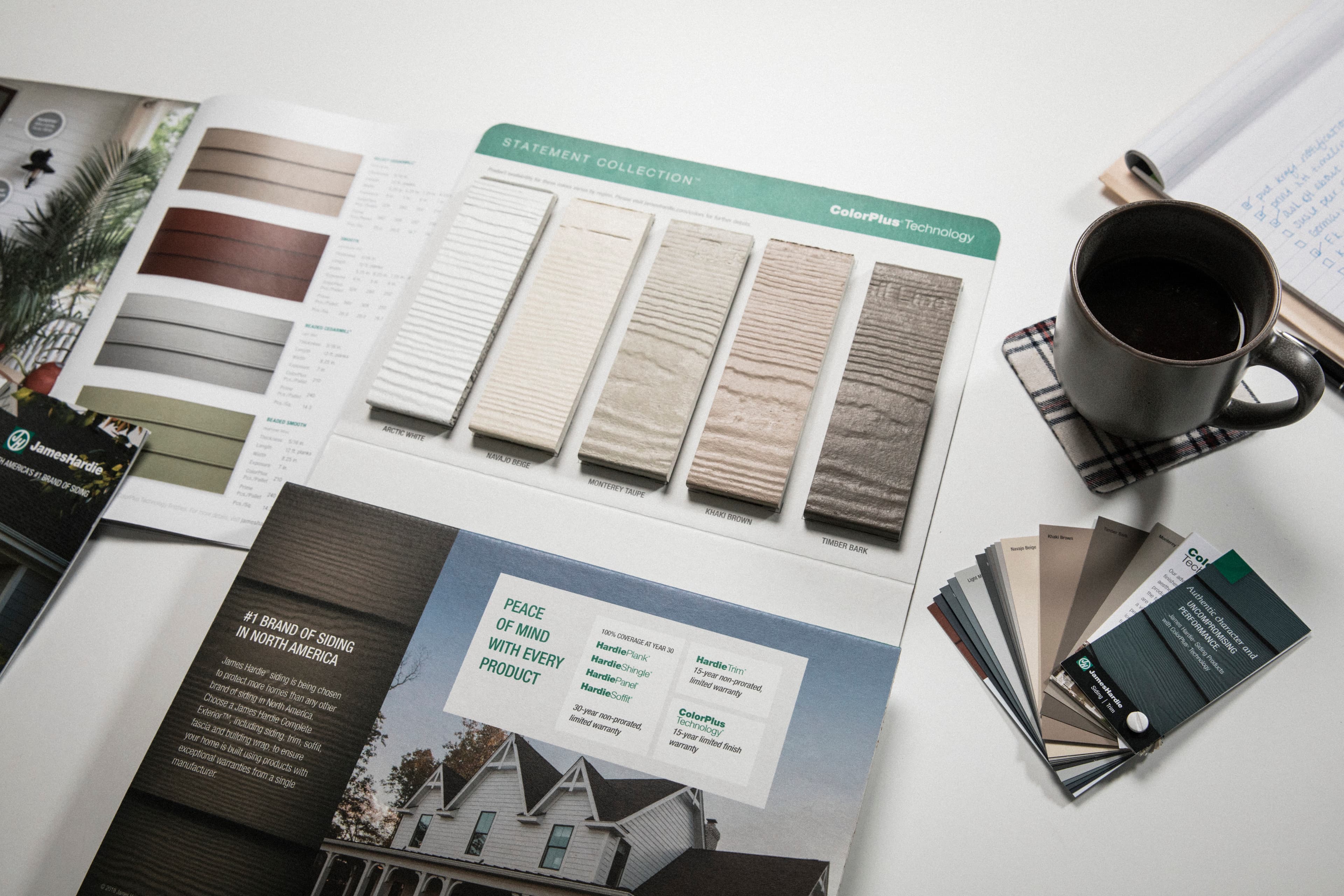
The TimberHue™ Collection features an array of color options— ranging from warm chestnuts to cool greys—reflecting today’s design trends while maintaining timeless appeal. Each of the eight colors was hand-selected by design experts to create a warm, welcoming exterior that feels both natural and elevated. Mix with other Hardie® products for a modern, mixed material aesthetic or used as an accent to highlight architectural features. Order a free sample below to see and feel the difference.
Unknown Component
Received request from Uniform to render a component with the public ID: disclaimerText.
<UniformComposition /> does not have disclaimerText mapped to a React component yet.
To teach your app how to render this component:
- Create a React component and register it with Uniform, for example
function DisclaimerText({ text, theme }) {
  return (
    <div>
      DisclaimerText!

    </div>
  )
}

registerUniformComponent({ type: "disclaimerText", component: DisclaimerText })
Props that your React component will receive
{ "text": "TimberHue™ Collection is launching with limited regional stocking and will be available nationwide soon. Samples are only available in ZIP codes with product availability.", "theme": "white", "component": { "type": "disclaimerText", "parameters": { "text": { "type": "text", "value": "TimberHue™ Collection is launching with limited regional stocking and will be available nationwide soon. Samples are only available in ZIP codes with product availability." }, "theme": { "type": "select", "value": "white" } } } } - Import the component into the file where
<UniformComposition />is defined, for exampleimport "../components/DisclaimerText.tsx"
Need more help? Check out the documentation.
See the inspiration behind the collection
Discover the innovation behind the two-tone finish and see why homeowners are already choosing it for their exteriors.
Why choose the TimberHue™ Collection?
Learn why California homeowners Josh & Kristen chose to use the TimberHue™ Collection for their home.
Curating the collection
Hear directly from the James Hardie Product and R&D teams on the inspiration behind the TimberHue™ Collection.
Unknown Component
Received request from Uniform to render a component with the public ID: hoverSlider.
<UniformComposition /> does not have hoverSlider mapped to a React component yet.
To teach your app how to render this component:
- Create a React component and register it with Uniform, for example
function HoverSlider({ body, headline }) {
  return (
    <div>
      HoverSlider!
      <UniformSlot name="content" />
    </div>
  )
}

registerUniformComponent({ type: "hoverSlider", component: HoverSlider })
Props that your React component will receive
{ "body": "See how Symbi Homes transformed a 1950s kit home using the TimberHue™ Collection Hardie® Plank, paired with Hardie® Architectural Panel and Hardie™ Architectural Metal Trim. This project created a modern, low-maintenance exterior with the authentic look of wood, honoring the home's history while ensuring lasting performance.", "headline": "Modernizing a Classic: Symbi Homes and the TimberHue™ Collection", "component": { "type": "hoverSlider", "slots": { "content": [ { "type": "media", "parameters": { "src": { "type": "text", "value": "//images.ctfassets.net/dzi2asncd44t/2sFvEPYC3FH76A1YECR0wU/3a03c9a47c9145b536674509cf6b4d68/updated_afterhouse__1_.jpg" } } }, { "type": "media", "parameters": { "src": { "type": "text", "value": "//images.ctfassets.net/dzi2asncd44t/3Gxfsh7EhczkvToxAtkY6J/eacdb4388539b581d1f240b2a5bc3dff/updated_beforehouse__1_.jpg" } } } ] }, "parameters": { "body": { "type": "text", "value": "See how Symbi Homes transformed a 1950s kit home using the TimberHue™ Collection Hardie® Plank, paired with Hardie® Architectural Panel and Hardie™ Architectural Metal Trim. This project created a modern, low-maintenance exterior with the authentic look of wood, honoring the home's history while ensuring lasting performance." }, "headline": { "type": "text", "value": "Modernizing a Classic: Symbi Homes and the TimberHue™ Collection" } } } } - Import the component into the file where
<UniformComposition />is defined, for exampleimport "../components/HoverSlider.tsx"
Need more help? Check out the documentation.
Find your style
See how beautiful your house could look with TimberHue™ Collection siding products.
See the TimberHue™ Collection on your home—instantly
Our design tool, Hardie™ Designer, powered by Hover®, allows you to see your home clad with Hardie® products instantly, with just one image! Try it now with your home.
Unknown Component
Received request from Uniform to render a component with the public ID: hoverEmbed.
<UniformComposition /> does not have hoverEmbed mapped to a React component yet.
To teach your app how to render this component:
- Create a React component and register it with Uniform, for example
function HoverEmbed() {
  return (
    <div>
      HoverEmbed!

    </div>
  )
}

registerUniformComponent({ type: "hoverEmbed", component: HoverEmbed })
Props that your React component will receive
{ "component": { "type": "hoverEmbed" } } - Import the component into the file where
<UniformComposition />is defined, for exampleimport "../components/HoverEmbed.tsx"
Need more help? Check out the documentation.

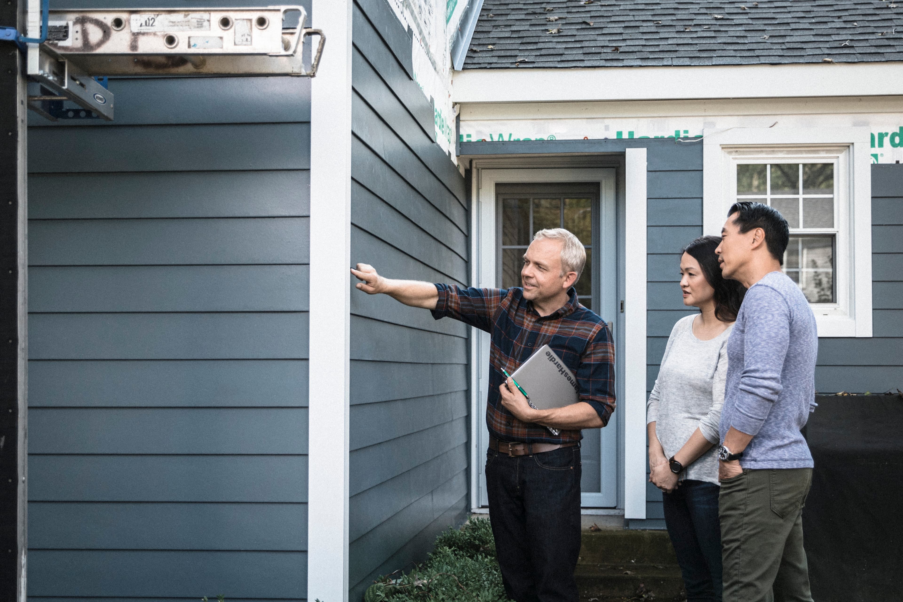
Your re-side story starts here
Ready to transform your home? Find local contractors who can make your home exterior project simple—and simply beautiful.
Unknown Component
Received request from Uniform to render a component with the public ID: disclaimerText.
<UniformComposition /> does not have disclaimerText mapped to a React component yet.
To teach your app how to render this component:
- Create a React component and register it with Uniform, for example
function DisclaimerText({ text, theme, asteriskCount }) {
  return (
    <div>
      DisclaimerText!

    </div>
  )
}

registerUniformComponent({ type: "disclaimerText", component: DisclaimerText })
Props that your React component will receive
{ "text": "TimberHue™ Collection is launching with regional stocking and will be available nationwide soon. Sample ordering capability is only in zip codes with product availability.\nIndividual colors may vary depending on display settings. Samples only available in Select Cedarmill® texture. Please check with your contractor or local dealer for availability in your area.\nHover is a registered trademark of Hover Inc.", "theme": "dark", "asteriskCount": 3, "component": { "type": "disclaimerText", "parameters": { "text": { "type": "text", "value": "TimberHue™ Collection is launching with regional stocking and will be available nationwide soon. Sample ordering capability is only in zip codes with product availability.\nIndividual colors may vary depending on display settings. Samples only available in Select Cedarmill® texture. Please check with your contractor or local dealer for availability in your area.\nHover is a registered trademark of Hover Inc." }, "theme": { "type": "select", "value": "dark" }, "asteriskCount": { "type": "number", "value": 3 } } } } - Import the component into the file where
<UniformComposition />is defined, for exampleimport "../components/DisclaimerText.tsx"
Need more help? Check out the documentation.
Unable to find Uniform Context. Ensure the devtools plugin is activated.
 Get a Quote